NORITZ, a Japanese home appliance brand with 70 years of craftsmanship, has been dedicated to providing high-quality gas water heating products. To reshape NORITZ’s brand perception in the Chinese market, we built upon its brand vision, “Delivering a joyful hot water lifestyle to the world.”We redefined its color system, infusing the palette with vibrant textures, which allows the signature NORITZ Red to shine with greater confidence and creativity in brand communications.
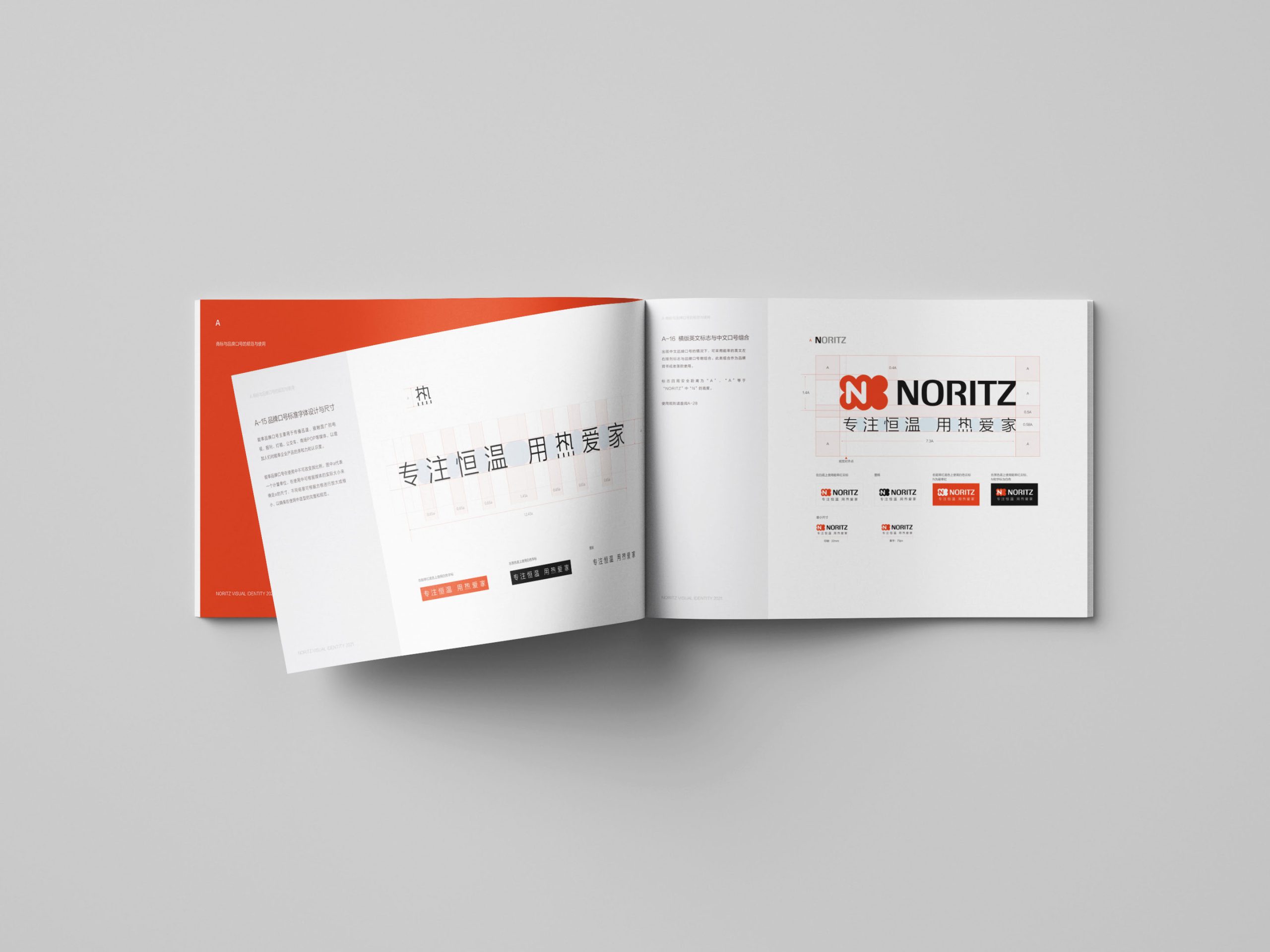
NORITZ has been operating in China for nearly 30 years, during which it has developed a relatively rigid brand image. Meanwhile, domestic brands have risen and established a dominant position in the market. The disorganized system of NORITZ’s brand communication has made it difficult for consumers to form a clear and accurate perception of the brand.
We need to redefine NORITZ’s international brand image and reinforce its association with high-quality products.
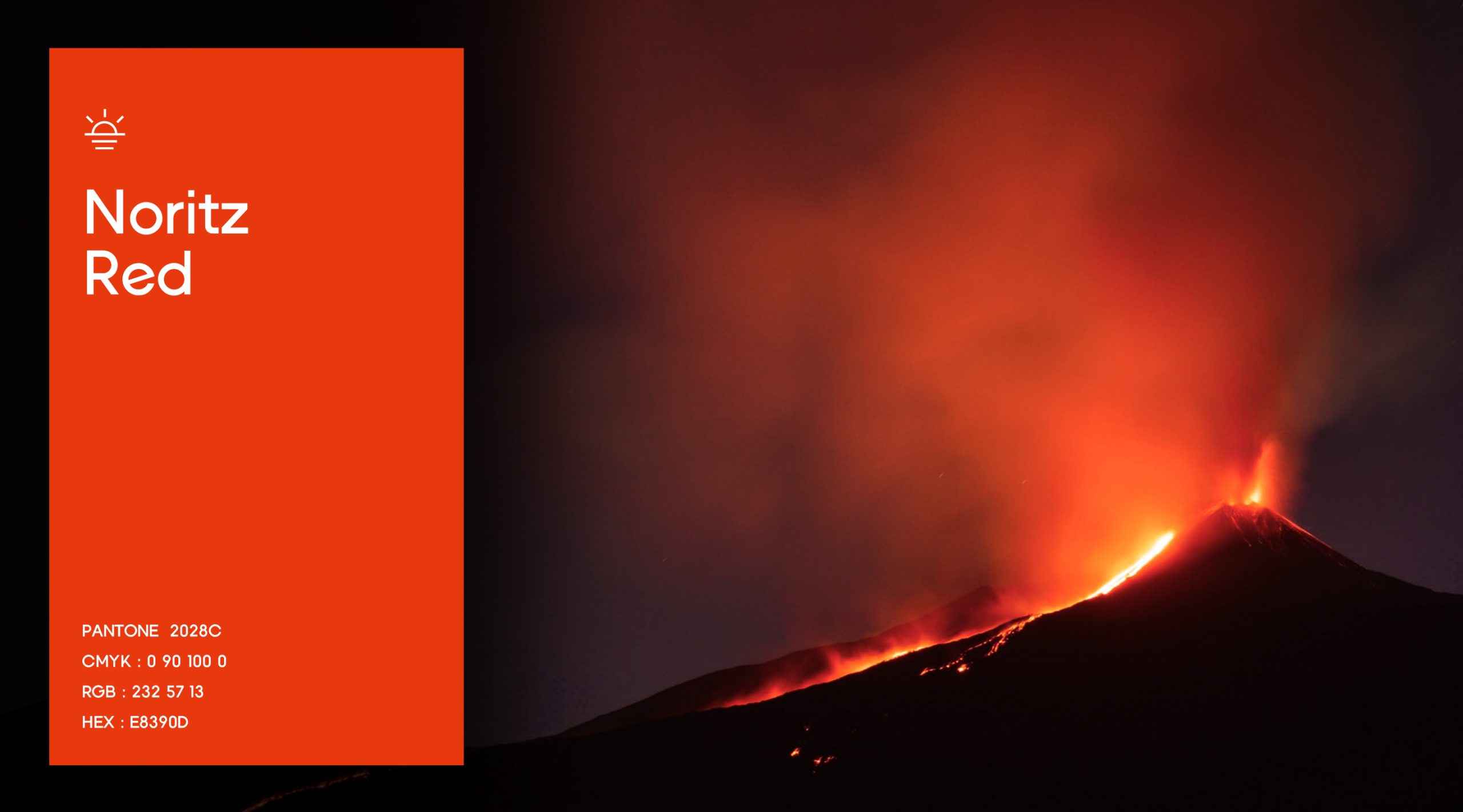
By leveraging the visual elements of “heat and light,” we aim to portray the highlights of life where people shine and inspire, reflecting an inner spirit of focus and love. This approach allows us to rewrite the brand’s color narrative. Through visual consistency, we enable the brand to connect intuitively with users, reshaping its perception and impact.
