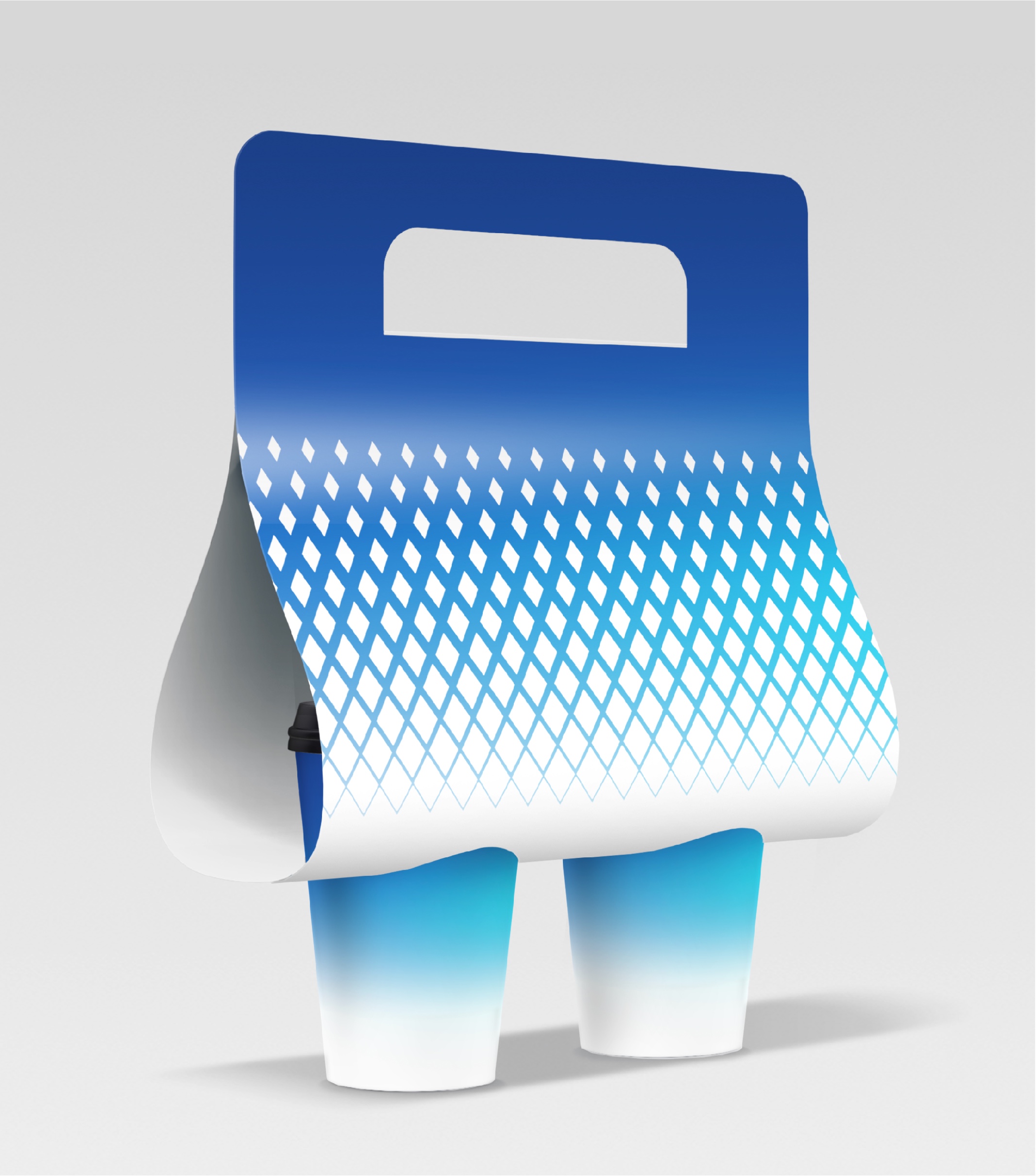
Wuling Group, a homegrown Chinese automotive brand, became well-known for its affordable, durable small trucks, favored by young entrepreneurs. As market dynamics and consumer preferences evolved, Wuling aimed to break free from its traditional image of “affordable, utilitarian vehicles” and reposition itself as a brand that is more youthful, diverse, and technologically advanced to appeal to a new generation of consumers. Commissioned by Wuling’s agency, Shanmei Advertising (A subsidiary of Hylink Group), we were tasked with refreshing the brand’s image to lay a forward-looking and inclusive foundation for its future development.
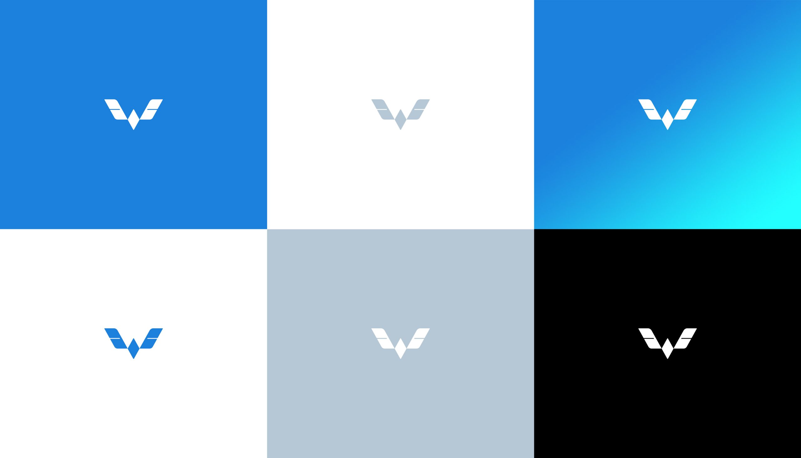
The key challenge in the brand revitalization was the ‘reconstruction of the color system’. Wuling’s broad vehicle range, from budget trucks to mid-range family cars and even new energy vehicles, required a color scheme that could maintain the brand’s core spirit while being adaptable and scalable. Through in-depth market research and client insights, we uncovered a vital realization: Wuling has been the “first vehicle” for many young entrepreneurs, witnessing and supporting their efforts and growth.
Building on this insight, we introduced the design concept of “Soaring with the Youth.” The original Wuling logo resembles a pair of wings in flight, symbolizing companionship and upward movement, while the color system became a crucial element in conveying this concept visually.
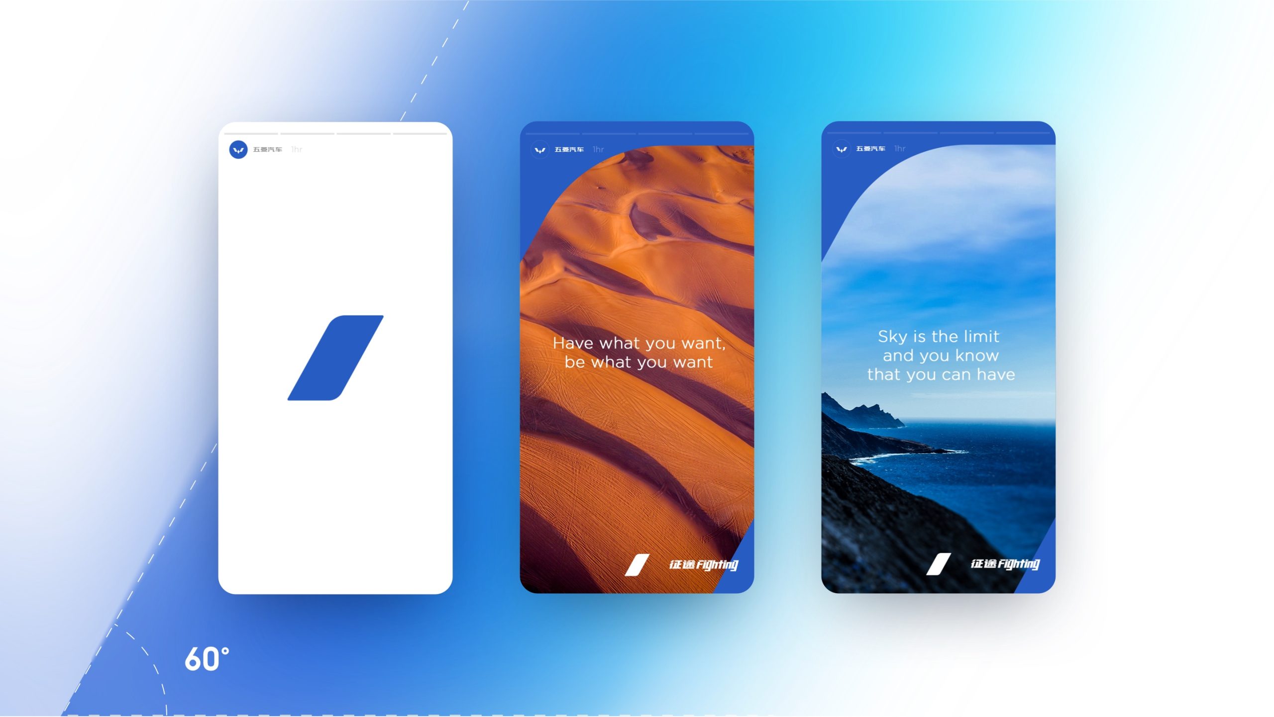
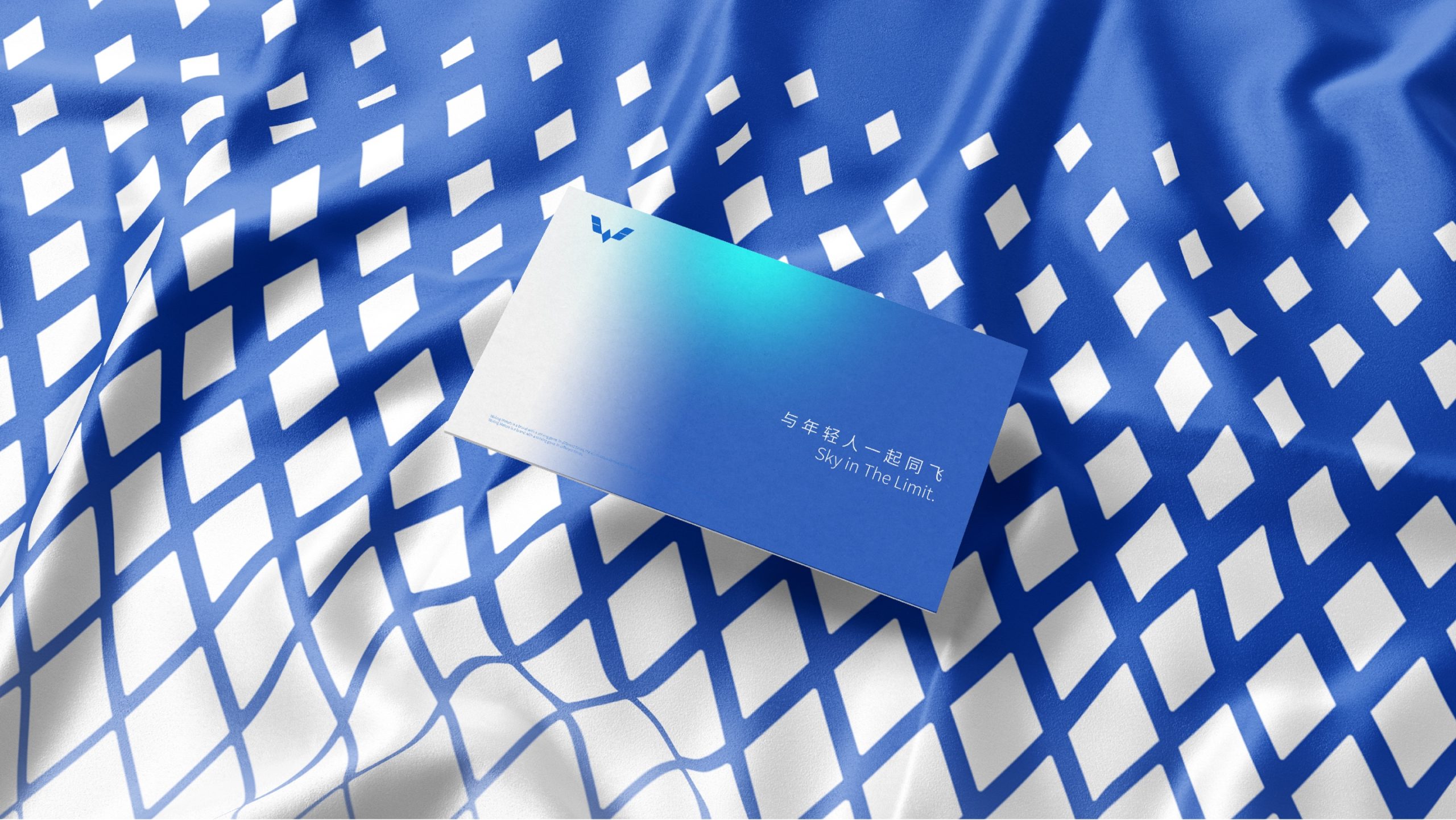
In the new brand design, we shifted Wuling’s primary color from its traditional red to **Sky Blue**, a color symbolizing the future and vast possibilities, which aligns with Wuling’s repositioning as a youthful and technology-driven brand. The classic red was redefined as the primary color for the “Red Label” sub-brand, preserving the brand’s heritage. To strengthen the emotional connection with consumers, we proposed the concept of “12 Sky Phases,” drawing inspiration from the different hues of the sky throughout the day. This idea incorporates morning light blue, midday brightness, evening golden orange, and deep purple at night, creating a rich gradient color palette that reflects Wuling’s journey alongside consumers across time and space.
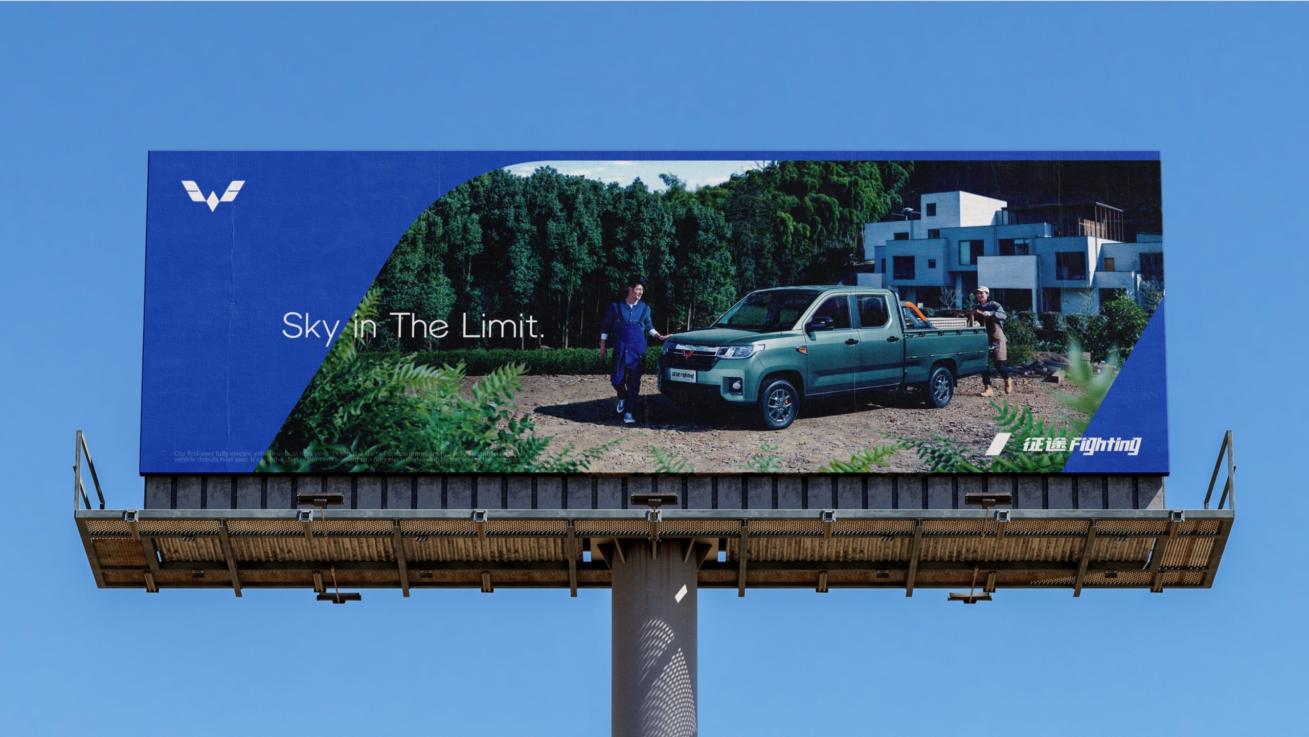
The new brand image has successfully broken through Wuling’s traditional constraints, injecting new vitality into the brand. The color system not only balances the brand’s traditional legacy with its innovation needs but also strengthens the emotional bond between Wuling and the younger generation. The new design has also empowered Wuling’s mid-range “Silver Label” models to present a more high-end, tech-forward image.
Through this brand revitalization, Wuling has successfully transitioned from being seen as a “low-cost utility vehicle” to a “youthful, diverse, and technologically advanced” brand. Wuling is no longer just a companion for entrepreneurs; it is now a partner in the pursuit of dreams for a new generation. Wuling, soaring with the youth!

